

Overview
Once a company starts to grow, stocked products including assets, materials, supplies, and finished products tend to need more advanced and user-friendly systems to replace their manual, simple, and most likely outdated system.
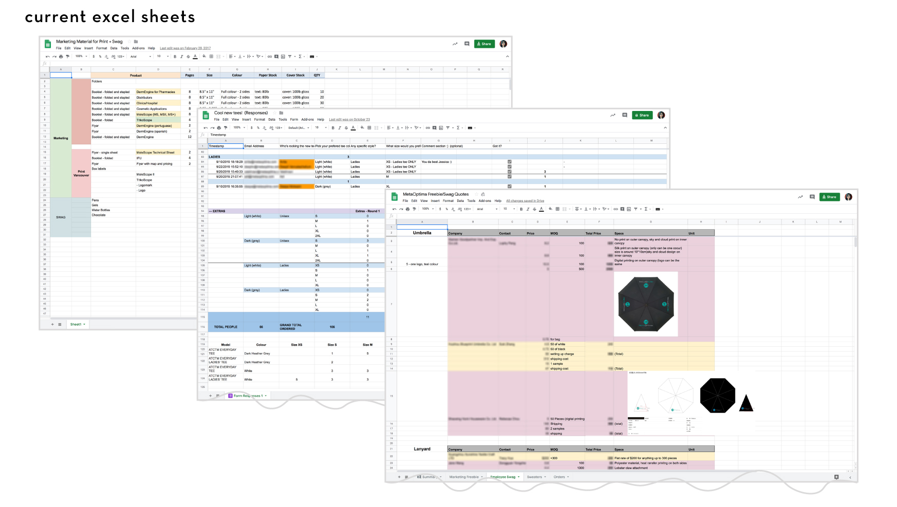
With a constant flow of materials and devices being received, manufactured, and shipped out constantly, both marketing and hardware teams need a streamlined and up-to-date inventory and asset tracking system in order to better organize and manage all the inventory. The current inventory is located in several storages and shelves that not only makes it hard to keep track but also to keep updated as everything is done manually either marking it directly on the box or when we get access to the online spreadsheet.
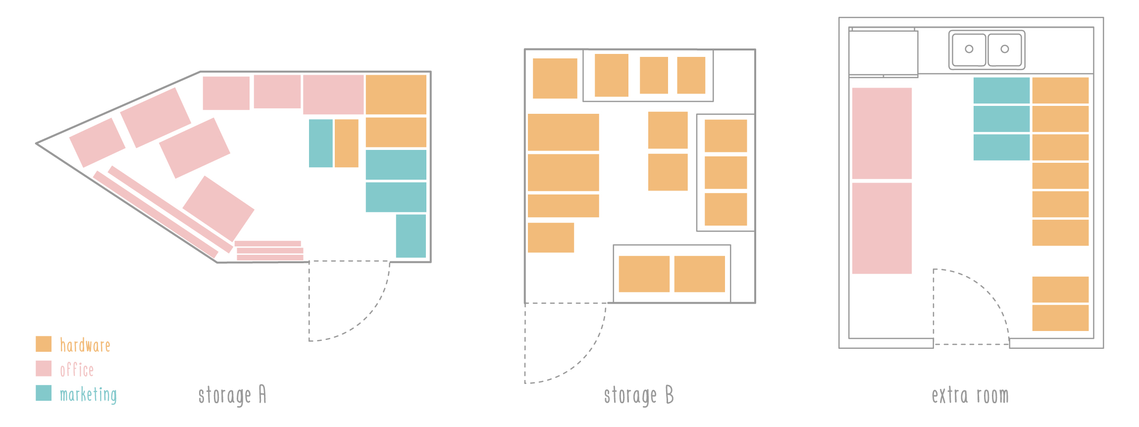
Right now, the majority of the storage spaces the company has is being used between the office/admin, marketing, and hardware teams to store different supplies. Most of the hardware inventory and material are in both storages, the extra room, one drawer unit, and the storage shelf with a few items on their workstation. As for marketing, the majority of the material is located in one of the storages in the basement, one drawer unit, a few cubes on a shelf unit, and the extra room. Finally, one of the storage room and the extra room the marketing team is also being shared with office furniture and material.

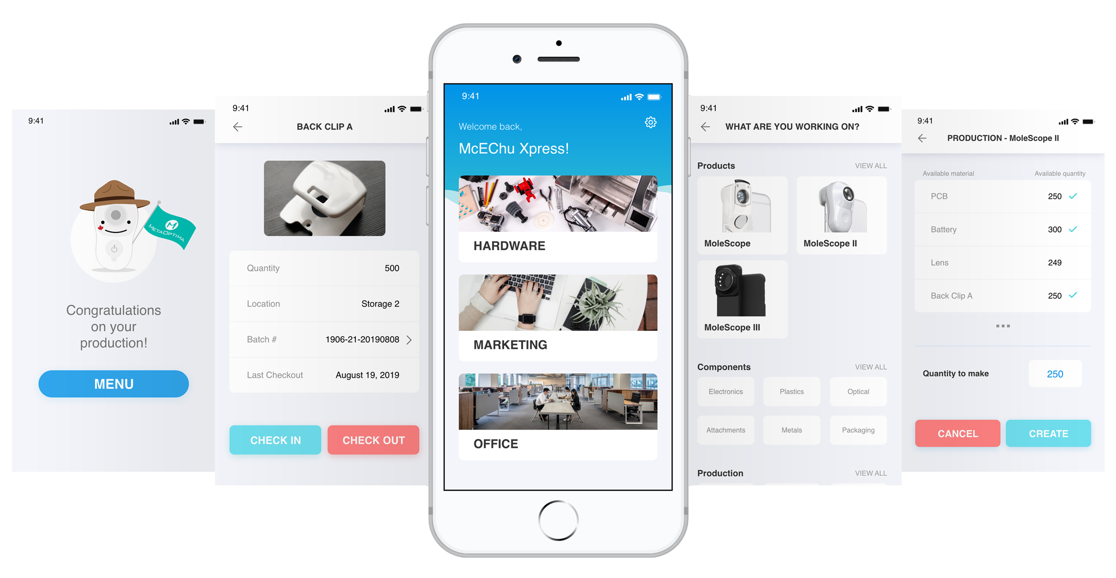
We designed a system to improve the current outdated practice for office/admin, marketing, and hardware teams to assist them with the overall management workflow and automation of manual processes for a more accurate and efficient inventory. By having a mobile solution, it allows for real-time updates with less margin of error when working with several products.
Knowing my teammate has never worked on any (design) project from scratch, I took the opportunity to propose and guide her on how some UX projects take shape. Together we carried out user and competitive research, affinity diagrams, sketches, user flows, created the presentation slides and pitched the project. Specifically, my tasks included sketches, mockups, prototyping, visual design, user experience, interaction design, and user interface elements.
The project was part of a one day hackathon style event. With only 6 hours on the clock, we drafted a simple agenda that included some of the main design stages we needed to achieve. By having an idea of all the steps we had to go through, we knew we weren't going to be able to conduct usability tests outside of the team as everyone was busy with their projects and there wasn’t enough time.

To gather useful and qualitative data regarding known gaps, pain points, preferences, and practices, we started researching inventory systems currently on the market. We then started affinity diagramming to learn more about our current system’s major pain points and gaps. The content came from the team since we’re the main stakeholders using the system and in charge of most of the inventory.
We first looked into the market to check whether existing products to help event coordinators manage and plan simultaneous events already exist and what kind of features they were missing.

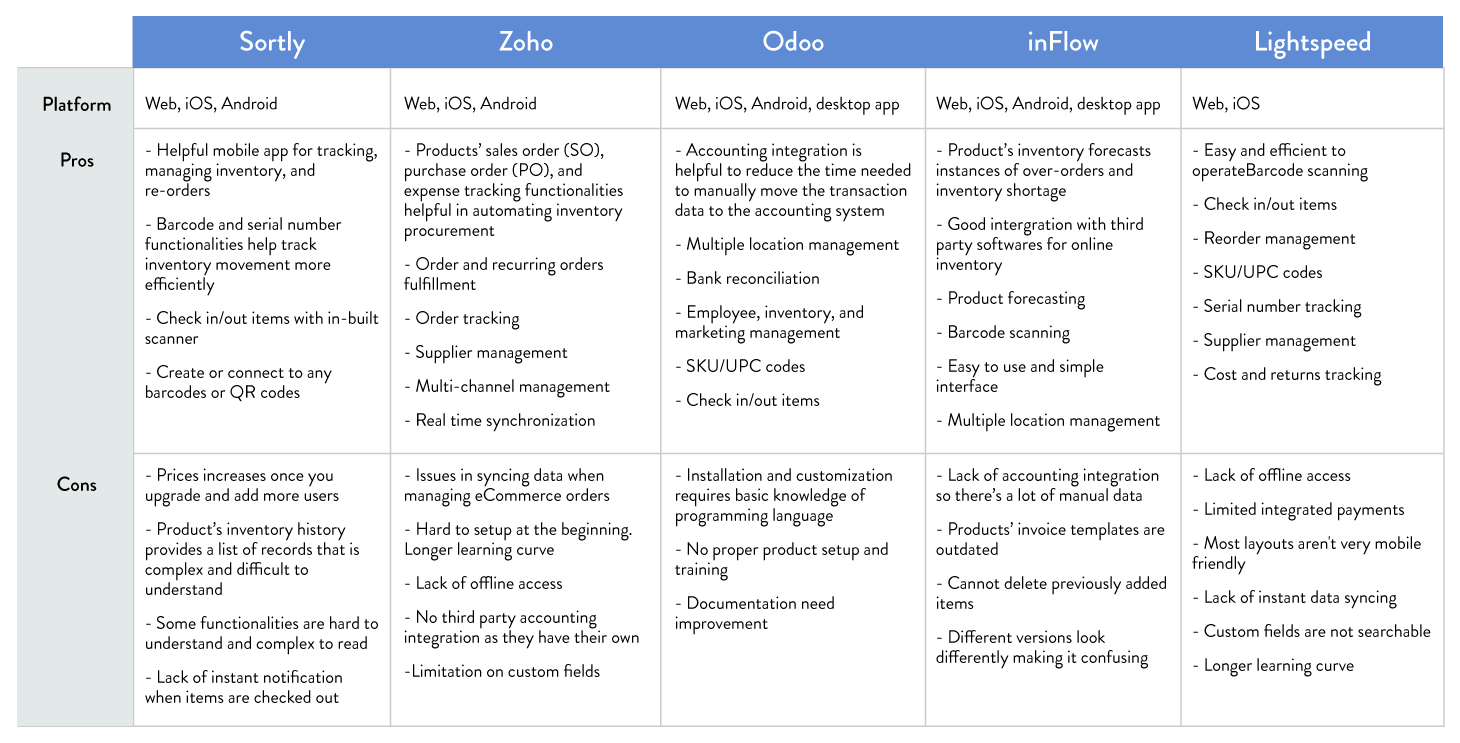
We did a brief pros and cons list for each of the below competitors to see what they brought to the table and what they were lacking that would be useful for us when designing our management system.
Research
Ideally we would of prefered to conduct interviews, send out questionnaires, and observational studies but there was nobody we could have interviewed externally nor did we not have the time; therefore, we decided to focus on pain points and information we already knew from our experiences and day to day tasks related to our inventory.
We started by listing current processes, steps, gaps that we knew needed improvement, and major pain points of our current inventory system in order to create an affinity diagram. Although the data was mainly from us, we are the main people who manage and need access or material that’s in the inventory.
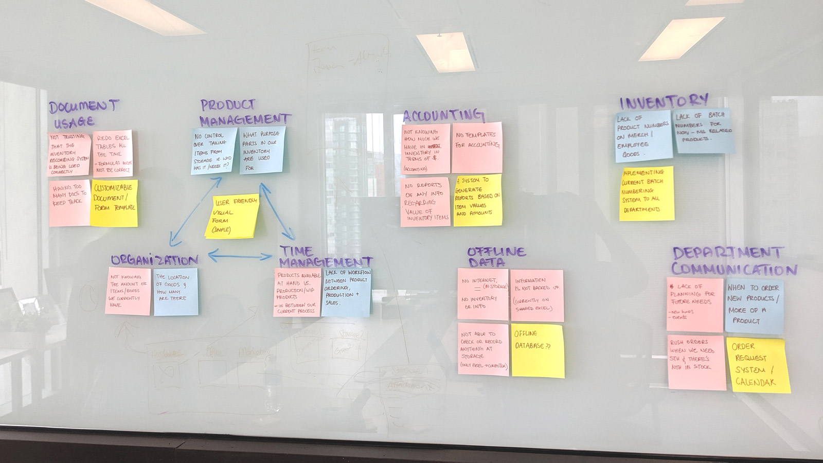

Based on the data, we learned the following:
We then incorporated the research insights from the interview, background research, and affinity diagram, and concluded possible opportunities for improvements:
The goal is to design and create an inventory management system that isn’t one fit all but rather one that can be customized by each team based on their needs. With all the information and insights in mind, we came up with potential solutions to at least solve some of the main pain points we’re experiencing to close some gaps.
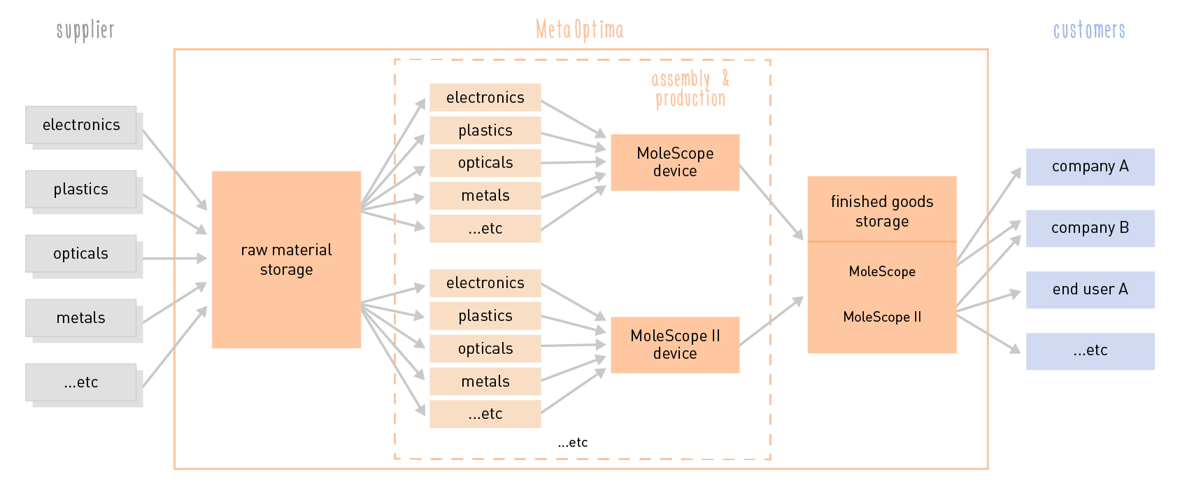
Knowing the 4 classifications of inventory types (raw material, work-in-process, finished goods, and MRO goods like consumables, computers, furniture, etc.), assisted with our ideation stage and our decisions regarding certain features that were needed. One of them was adding the possibility of moving items from one classification or stage to another, mainly from raw materials into production without having to check them out of the general inventory. Except for MRO goods, nearly every item from hardware goes through the acquisition of materials, production of goods, and storage of finished goods.
Design
We started with a brainstorming session as well as a sketching session to come up with possible interfaces to help solve the above-mentioned pain points. During our brainstorming session, we discussed several aspects we wanted to incorporate into the interface that we thought were important but were just part of the original insight we found. With our insight and some of our research data, we wanted to incorporate the design opportunities we came up with to solve the current issues. As we were on a time crunch and already spent a few hours on research and affinity diagramming, we decided to combine the sketches with a task flow to make sure steps were not missing in any of the key screens for the scenario we wanted to demo.
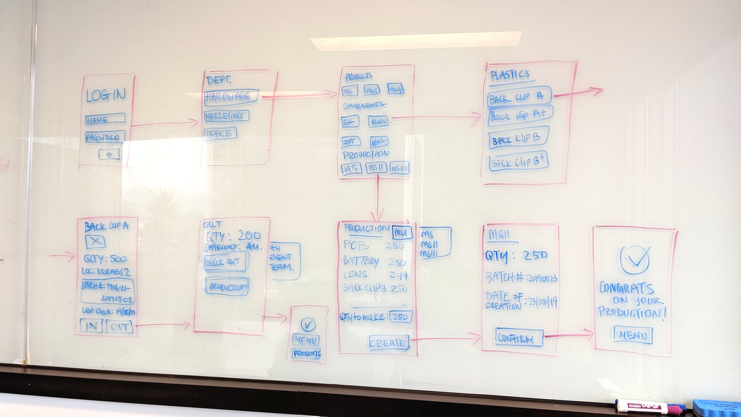
During our sketches & task flow session, we did a few quick usability testing as a team on the sketches we had on the board. We simply tested the main steps and tasks we wanted to show to make sure the experience and flow was what we wanted as a solution. We then made some edits on it before moving on into the digital process.
Once the sketches and task flows were set, I started creating mockups and a prototype of our proposed system interface using Adobe XD while my teammate Helen worked on the presentation slides.
Due to the time limit, I used assets from an already existing kit to match to reduce the overall time spent on the UI and branding of the project. Time was mostly spent on user experience, app interface, and interactions. All in all, it took approximately 3 hours to create elements, mockups, and the prototype. I repeatedly tested the application myself because there wasn’t time for usability tests with external users. I tried identifying possible flaws to make sure they were corrected before delivery.
We designed and presented a clickable prototype to showcase a new inventory management system app that was customized based on the different departments’ needs. The system serves as a central hub to keep track of all departments’ inventory with offline access and real-time updates while allowing faster data entry for increased productivity and accuracy workflows.
I presented and did a walk through of our solutions as a clickable prototype to showcase the new system designed based on our research, experience, and what we would like to have that would improve accuracy and speed when it comes to inventory management.
Latest Design
Our project won first place among the 12 projects presented during the first-ever PDP at MetaOptima. It also got recognition from some C-suite executives as well as several colleagues who all were interested in implementing the project in the future to help organize and improve the workflow and management of the different departments’ inventory.
There were a lot of other opportunities for improvement and features we came up with during the brainstorming and ideation stages that we would like to expand and implement in the future. As for next steps we would like to focus on the following:
Prepare and conduct interviews as well as send out surveys to gather quality information regarding other users’ pain points and solutions/features that would be useful when it comes to managing and using an inventory system.
Conducting more usability tests with larger groups of users at different stages of the project to obtain more useful data and feedback to incorporate in future iterations to create a better and more useful app
Once all the usability and user experience steps are done, I would like to focus on the user interface and visual design of the system to make it aesthetically pleasing and clean to use, especially for when users are overwhelmed with other tasks or are in a slight rush while using the system.
Ideally, we would like to incorporate some features to the system to expand on it’s functions to better aid the inventory system for all users to not only automate but also speed up the process:
Future Steps
With this project, we challenged ourselves to design and create an application to solve recurring hardware and marketing departments' pain points. We learned how initial research and insight from key stakeholders are crucial aspects to create a great product based on user needs.
If we were to make changes, we would spend less time on the affinity diagram or do a digital version to cut down time and skip several discussions regarding features we would like to include but at the end were too complex to incorporate in the limited amount of time.
Reflection
Our project won first place out of 12 projects in the first-ever #PDP at MetaOptima.
Recognition by C-suite executives as one of the projects that would be considered for implementation in the future.
Great job! I love it. Let’s talk to the tech team to implement it and we can even check if it can be incorporated with Salesforce to track our sales.
Looks awesome! This would help the hardware team a lot to keep track of inventory.
That’s a great idea for me to know where to find things in the future. It will save me so much time trying to find what I need.
Achievements & quotes